Client:
Snoqualmie Falls Lodge
Role:
Designer
Snoqualmie Falls Lodge, a legacy brand in the PNW that’s been around for decades, needed a refresh of their branding and food offerings, while keeping their historic heritage intact.
Notes:
Updating a heritage brand
The Snoqualmie Falls Lodge has been around for over a hundred years, being enjoyed since 1916, so when they wanted an update to their brand, the challenge was to retain their brand equity with established consumers while bringing their brand into the modern era.
The results
While keeping the core elements of the brand (Snoqualmie Falls waterfall image, logo badge, and colors) the overall packaging elements have been modernized and clarified for greater impact while keeping recognizability.
From old to new
The old Snoqualmie Falls Lodge badge was very simple, but quite antiquated with it using a small caps serif font and generic drop shadow container, so the goal was to create a unique badge that would be exclusive to the brand, while updating the font to a unique serif font. The badge was also designed to work well in the application of the new food packages that were being updated.
OLD LOGO
NEW LOGO
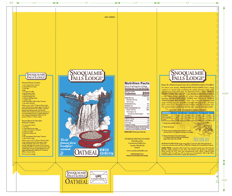
Refreshing the food packaging
The old food packages were outdated did not communicate clearly, for both the front and the back panels. So the goal was to not only restructure the visual elements for greater impact, but to also update the overall branding to be more current while keeping the established structure for brand recognition on the shelf.


